The invisible hand of the algorithm and the worship of ‘best practices’ has created an aesthetic world that is collapsing on itself. Every era throughout history has had hallmark design movements and notable aesthetics, but lately when it comes to visuals, strategy, copy, and even branding – brands have begun to blend into each other.
This isn’t a new thing to report on by any means. We’ve blamed the moodboard. We’ve called it blanding. We’ve even created airspace. The internet is the vehicle through which we all experience brands, and it creates a bubble of hyper-competition. To a certain corner of New York and Los Angeles, the perceived DTC giants mean everything. To the rest of America? I’m not sure.
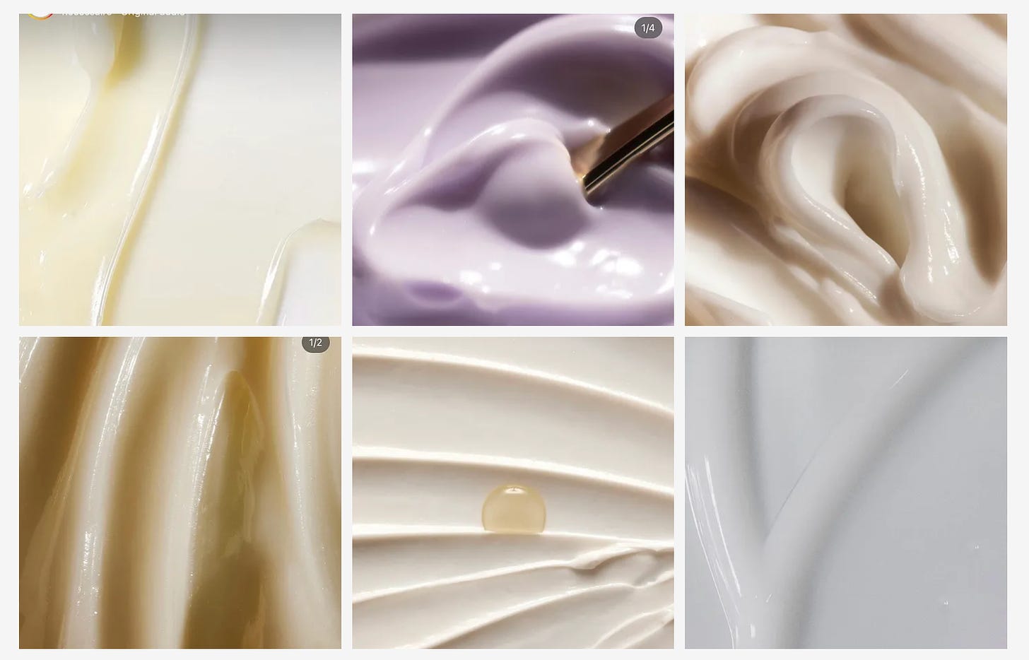
In the past week, I’ve seen (3!) young and highly successful beauty brands use the same rollout formula, roughly:
Moodboard to guess what might be dropping next
90s supermodel photos or photos of people on the team as kids
A texture swatch
At some point, it becomes a formula. And the formula works, but it’s really just there in service of chasing infinite growth. We’ve all lived through the pivot to video – which was a famously bad bet with analytics and metrics that were cooked by Facebook. In a precarious environment for startups where funding is hard to find and the pressure to generate outsized returns continues to mount, it’s seemingly obvious that brands would just do what works.
The perfect storm of continuing self-reference and the larger creative trend towards over-indexing on nostalgia has built an aesthetic world where it seems like there’s no new IP to be found. From glancing at most brands, devoid of typography, logos, or context you simply would not be able to tell which brand is which. Where’s the magic, people?
Emily Sundberg rightfully pointed this out in her newsletter, Feed Me.
Early on in my career, I remember there being a year-long stretch where almost every brand would reference Glossier in briefs. And at that time, Glossier was exciting. Glossier brought a fresh perspective that bottled the energy of a generation into easily shareable digital fodder and ushered in a no-makeup makeup movement that has created many brands in its own image: like Merit, Saie, Tower28, and more.
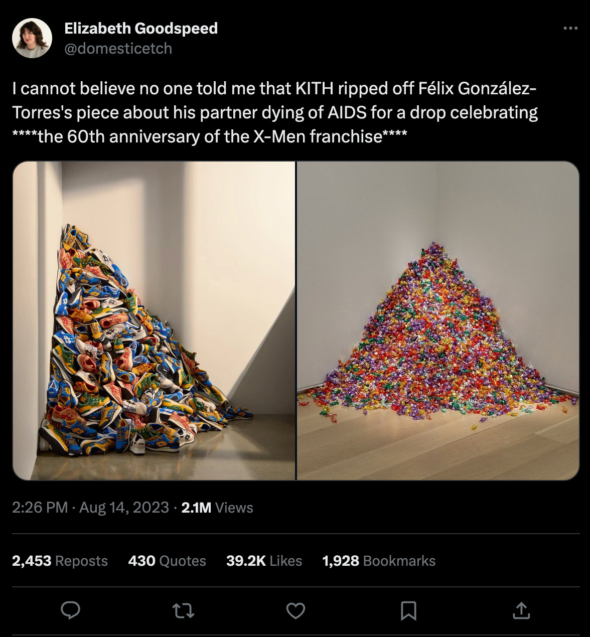
The enduring nostalgia cycle at large has built this bizarre collapsing cycle of culture and commerce. The reference references the reference until it’s a sea of sameness. Do we need ten brands that look the same? Ten movies in the same series? We don’t, but the risk of doing something different and taking a big swing isn’t rewarded easily by Big Capital.
Divorcing the reference image from the original context, remixing it, and then having that image be reworked by someone else is a total context collapse. The original artistic intent, when re-appropriated for vibes only is devoid of imagination at best, and inappropriate at worst.
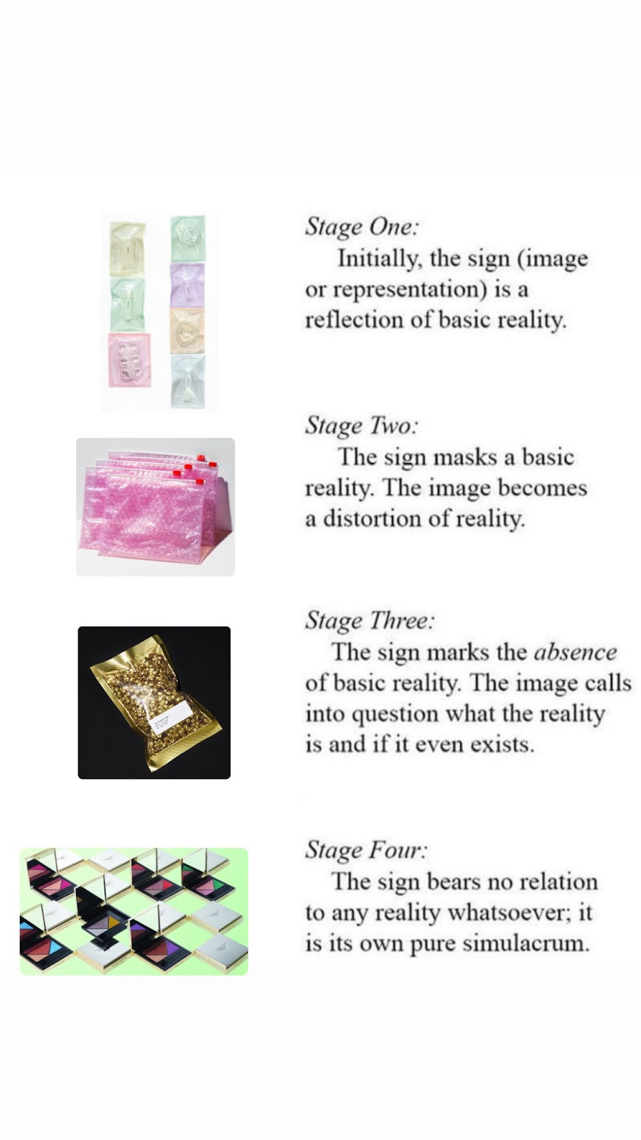
And that brings me to the thing that inspired this essay in the first place: The relaunch of Prada Beauty. Because let’s take a look at the source material:
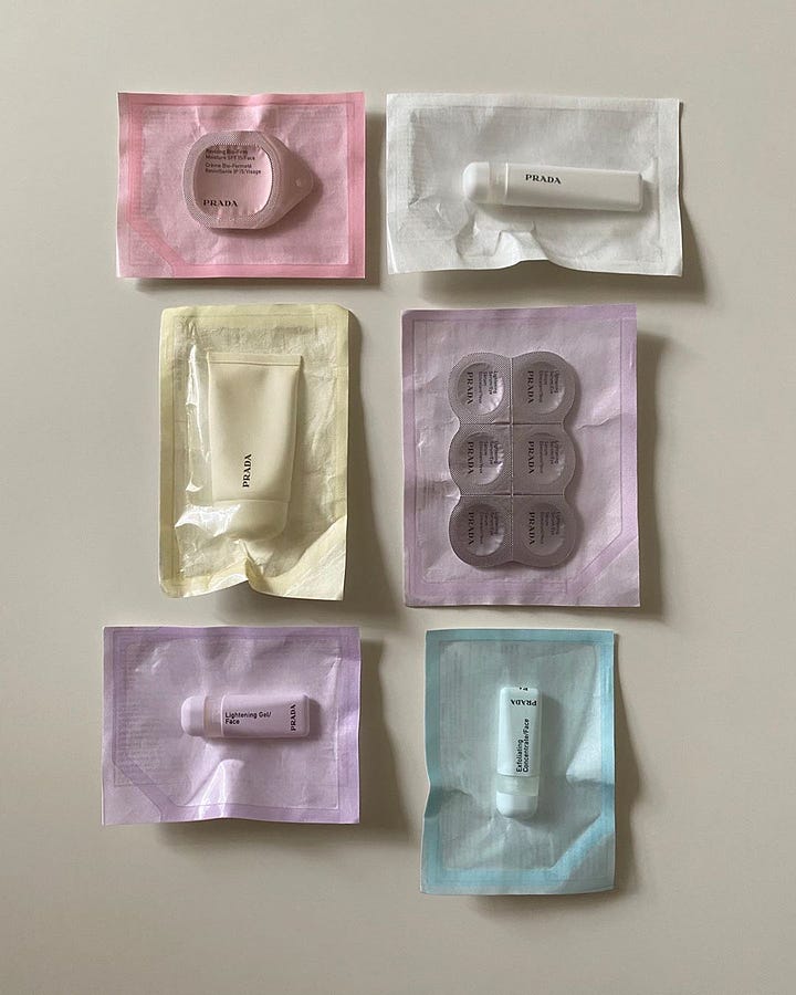
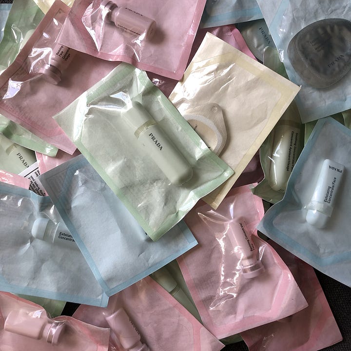
This is unique. It feels on brand and has that cool, calculated, and almost bored Prada detachment. And somehow, it feels native to the Instagram moment. I’m sure that Prada beauty was on the moodboard that built the glossier pink pouch, the Pat McGrath sequined sachet, and more.
The new Prada beauty, however is a safe luxury bet – it’s built for the flatlay. It’s devoid of personality, and trades in traditional glamour where we could build a point of difference. It’s something that feels safe at the shelf, would look at home on your grandmother’s dresser, and if you took away the logo it could really be any luxury beauty brand. Is luxury always in being ostentatious?
It’s this endless pursuit of cultural relevance and the reference culture we live in that’s landed us in a position where we idolize great creativity from the past to no end, but aren’t given the latitude to build things that are truly new. New is risky, new is bold, new is scary. The explore page is our new overlord, our new arbiter of what makes creative great.
To build more exciting beauty brands (and, let’s be real, brands in general) we must focus on fluency instead of relevance. Cultural fluency is the practice of understanding the context in which images, signs, and symbols operate – relevance, on the other hand, starts with building a moodboard and imitating what you’ve seen before. Relevance creates images that are devoid of context but work and fluency build new meaning. In other words: stop putting stuff on a moodboard and go outside. Read books! See museum exhibits! Find meaning, not vibes.
As the founder of a creative company, there’s this constant push-pull when answering an RFP – a pressure to either fold and commit to a singular, easy-to-define, productized style or the willingness to adapt to whatever is de rigueur. That’s playing a zero-sum game in which everyone – clients and creatives lose. Our job as creatives and responsible cultural stewards is to guide people to the best, most enduring solution for them – not the best solution for the moment.
It’s time we let go of pleasing the algorithm. We all die someday.



abolish the krabby patty secret formula for beauty brands and re-establish creative brand identities 2k23. thank u thank u thank u!!! a very (re)affirming read.
Such a great read. Just shared this with my team!